Mobile-first design is not simply making a desktop website smaller. It means deciding what matters most, making important actions easy to reach, and building an experience that works well with limited space, touch input, and changing connection speeds.

Why mobile matters for small businesses
Customers search on phones when they need a quick answer. They may be checking your services, opening hours, directions, reviews, or contact details while away from a desk. If the text is too small, the menu is difficult, or the page loads slowly, they can move to another business.
Design the essential journey first
Start with the actions that support your business: calling, booking, requesting a quote, finding a location, or understanding a service. Put those actions in a clear visual hierarchy. Do not bury them beneath decorative sections that are less important to a mobile visitor.
Can someone understand what you offer and reach the right next step using one hand, on a small screen, with a slow connection?
Improve usability and SEO together
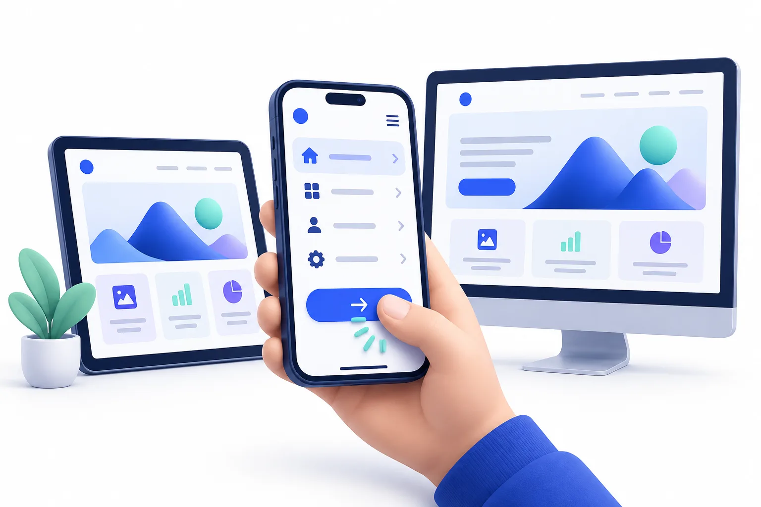
Readable headings, descriptive links, logical content order, accessible controls, and fast images help both people and search engines. Responsive design also prevents the duplicate or inconsistent experiences that can appear when mobile and desktop pages are maintained separately.
Keep performance in the design
Use appropriately sized images, avoid unnecessary animation, limit third-party scripts, and make sure buttons have enough space to tap comfortably. A beautiful mobile page should still feel quick and stable.

Test the real experience
Previewing a design on a large monitor is not enough. Test real phones, different browsers, touch interactions, form fields, menus, and common connection speeds. Watch where people hesitate and improve those moments.
Is your website ready for mobile customers?
SuperMind builds responsive websites that stay clear, fast, and useful from the first small screen to the largest desktop.
Build a Better Website